How I Took Honest Screenshots of the Software I Am Selling
I listed six software products on my marketplace and each needed a gallery. The rule I set: show the real product running, with invented demo data, and never touch the pixels. Here is the method, the problems I hit and a checklist.

· 6 min read
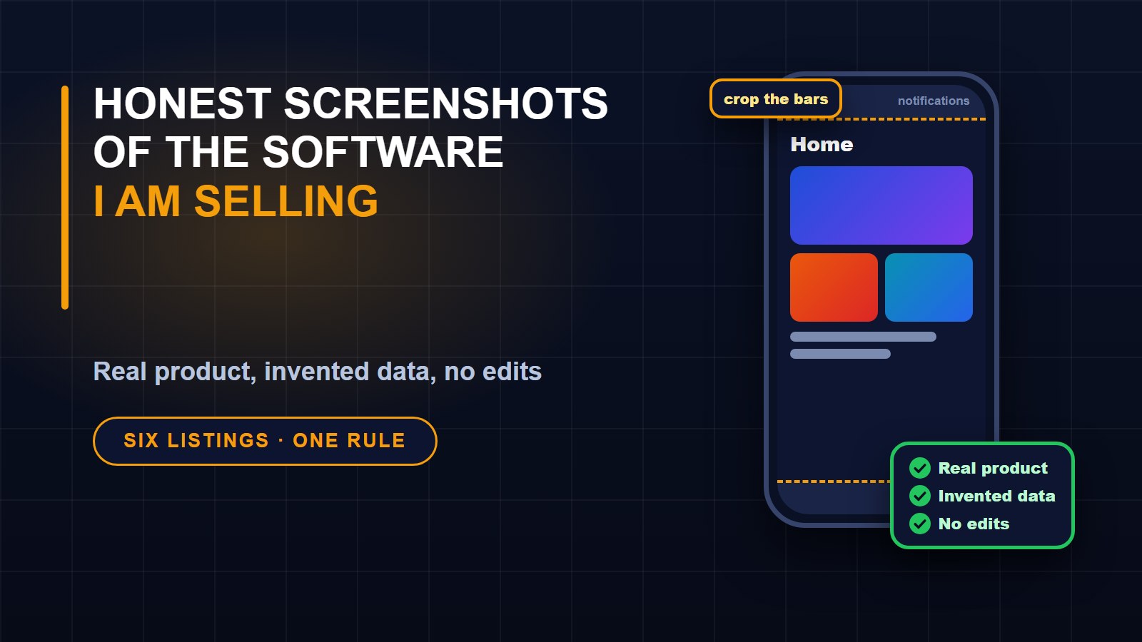
A product page lives or dies on its pictures. When I listed a video platform, its mobile app and a themes plugin on my marketplace, each in a single and an extended licence, I had to produce galleries for all of them. That was six listings and a lot of images.
Before taking a single screenshot I set one rule: every image must be the real product, running, and nothing in it may be edited. I would crop and frame, but I would never paint, patch or fake. This post is how I followed that rule and the problems that came up.
Use invented data, and say so
A screenshot of an empty product looks like nothing, and a screenshot of real customer data is a privacy problem. The answer is demo data that is obviously fictional.
My products ship with a demo setup: made-up channels, made-up videos, and gradient placeholder thumbnails instead of artwork I do not own. I used only that. Then I added one line to every gallery image and to the listing text saying the data is invented. It costs nothing and it answers the question every careful buyer has, which is whether those numbers and names are real.
Capturing the web screens
For the website I wrote a small script that drives a headless copy of Chrome through its debugging protocol. It opens a page at a fixed window size, signs in with a demo account, waits for the page to settle and saves a high-resolution image. Doing it by script rather than by hand means every shot has the same size and the same quality, and I can repeat the whole set in a minute when the product changes.
A few details are worth copying. I used test accounts that exist only in the local demo and never real credentials. I captured the pages a buyer cares about: the main feed, the watch page, the creator tools, analytics, the live-streaming page, the admin overview. And for the themes plugin I used its own preview feature to show four looks of the same home page, which changes nothing for other visitors because a preview only applies to my own session.
That preview feature leaves a small banner at the top saying which theme you are previewing. I hid the banner in those four captures with a line of code, because it describes the editor and not the product. The theme underneath was real, and I never switched the live theme.
The phone problem
The mobile app was harder. My first instinct was to install it on my own phone and capture the screen. It ran well, but two things spoiled the images. A floating assistant button from another app sat over the middle of the screen, and the status bar showed the icons of my own apps and notifications. Neither belonged in a product photo, and the second one showed personal information.
The fix was to use the Android emulator instead, a virtual phone on my computer with nothing on it but the system. The screens came out clean and generic. It was slower and complained once with a message that the system interface was not responding, which I answered by choosing to wait. I also learned to give the app time: my first tap landed before the video feed had loaded, so the screenshot showed nothing useful. I waited for the screen to finish loading, then tapped.
Whichever device you use, crop the status bar and the navigation bar from the final image. I removed them and also a thin border some devices draw around the screen, so only the app remains.
Frame for the page, not for the phone
My marketplace shows gallery images in a wide frame with a fixed shape. A tall phone screenshot dropped into a wide frame is cut off at the top and bottom, which can hide the best part. So I did not upload raw phone captures. I placed each one inside a drawn phone outline on a wide canvas, with a short caption on the left saying what the screen shows, such as native playback or the vertical shorts feed.
Every gallery image uses the same canvas size, the same colours and the same caption position, so the set looks like one product. Each listing also has a cover image, and the extended licence has its own cover with a different label, so a buyer can tell the two apart in the list.
Choose real screens that show something
Honest does not mean showing every empty state. In the demo, some videos have no file, so their page says coming soon. I did not use those screens, because they show nothing about what the product does, and I chose screens that were showing working features, such as a video that was actually playing. But I did not alter the ones I used. One watch page shows a short house advertisement before the video starts, because that is real behaviour of the product, and I left it in.
The review that caught my own mistakes
After rendering, I looked at each finished image at full size, not as a thumbnail. That is where I found problems. On the themes cover, my small labels for each theme were sitting on top of the thumbnails and hiding their top corners, so I moved them below. On the mobile cover, the phones overlapped awkwardly, so I changed the layout to two phones that do not overlap. None of this would have been obvious in a small preview.
A checklist you can reuse
1. Decide the rule first: real product, invented data, no edits.
2. Use a demo setup with fictional names and no artwork you do not own.
3. Capture by script so sizes and quality match, and so you can redo the set quickly.
4. Use test accounts that exist only in the demo, never real credentials.
5. For phones, prefer an emulator over your own device, or at least clear notifications and overlays.
6. Crop status bars, navigation bars and borders.
7. Frame every image to the shape your page uses, with a short caption.
8. Choose screens that show working features, and leave genuine details alone.
9. Say on the page that the data is invented.
10. Review every final image at full size before publishing.
Buyers cannot touch your software before they pay, so the pictures are the nearest thing to a demonstration. Making them honest is not only the right thing to do. It is also the best way to avoid refunds from people who expected something different.
About the author
Francis Landford
Software Engineer | Creative Problem Solver | Innovative Software Solutions & Modern Applications
More about Francis Landford →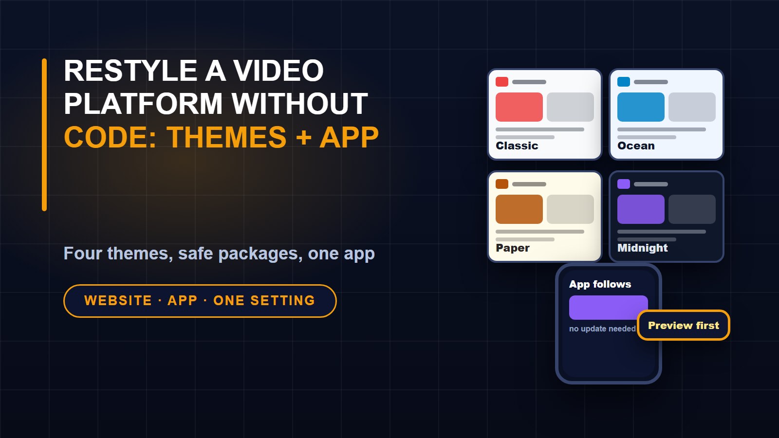
Discussion (0)
Sign in or create a free account to join the conversation.
No comments yet. Start the conversation.